Gestalt is one of the most important concepts for understanding logo theory.
In this post, I will show you tons of gestalt logo examples that will illustrate the following main concepts of logo design theory:
- Closure
- Figure / Ground
- Continuation
- Unity
- Balance
I will cover in detail:
- The role of gestalt in logo design
- 5 fundamental concepts of logo design theory with useful images
- Tons of Gestalt logo examples from real life
Let’s dive right in.
Table of Contents
Gestalt Principles in Logo Design
In psychology, the term gestalt (which in German means something like “unified whole”) describes humans’ capacity for “cumulative perception”.
Basically, it refers to our tendency to “fill in the gaps” in everything we see.
You see:
As humans, we are unable to analyze every single piece of information that is presented to us.
Instead, we tend to process our surroundings by using preconceptions, biases, and stereotypes that allow us to make decisions quickly.
In other words:
This ability allows us to see “wholeness” in the things we perceive.
In the 1920’s, the Bauhaus art school introduced the concept to graphic design to explain visual perception. According to this school, “a design’s unity is more than the simple addition of its parts.”
When we perceive a logo, we “fill in the gaps” not only in terms of what we literally see but also in terms of what those elements represent.
By understanding the role of gestalt in perception, with are able to create logos that interact with people’s expectations, knowledge, and attitudes.
You can learn more about the concept of gestalt in this detailed post about graphic design principles:
Let’s now look at the 5 main concepts behind gestalt theory.
MY NEW ONLINE COURSE
Thinking Like a Designer
Learn my proven method to finally understand the rules of any design and jumpstart your path to become an effective graphic designer
Gestalt Logo Examples (Closure, Figure/Ground, Continuation, Unity, and Balance)
1. Closure
The concept of closure in logo design theory is closely related to gestalt.
A logo is not an illustration or a painting. It’s a visual summary of a brand’s identity or essence.
This means that logos have to communicate iconically.
In other words:
A logo has to be able to communicate with minimal elements.
Therefore, a logo has to accomplish a lot with very few resources.
Through closure, a logo is able to communicate by suggesting ideas or concepts with only a few elements (such as an icon, color, shapes, or typography).
In sum:
Closure allows the viewer to complete unfinished forms or ideas.
As Alex White states in his excellent book, closure “encourages active participation in the creation of the message.”
2. Figure/Ground
Another way in which a viewer applies wholeness or totality relates to the concept of figure / ground.
Figure/Ground describes our capacity to perceive the relationship between form (shape) and its surrounding space.
In other words:
Our sense of wholeness or unity depends on how we perceive the relationship between an object and the space in which it is contained.
By strategically playing with this relationship, a designer can create interest, memorability, or meaning in a logo.
3. Continuation
In our desire for wholeness, we’re also able to follow the logical direction of visual forms, even if they’re not on a page or design.
This is called continuation.
Let’s look at some more examples:
MY NEW ONLINE COURSE
Thinking Like a Designer
Learn my proven method to finally understand the rules of any design and jumpstart your path to become an effective graphic designer
The Subway logo is an example of the Gestalt principle of continuation. Notice how we tend to follow the direction of the end arrows outside of the composition.
Another example:
If you encounter a sign that says “Exit” with an arrow pointing to the right, Where do you look?
Your perception logically makes you “follow” whatever goes beyond that arrow.
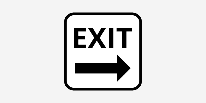
That is:
Through continuation, we are able to view the “wholeness” of a design even if not all of its elements are depicted right there on the page.
4. Unity
We also search for wholeness by applying the principle of unity.
In graphic design, unity refers to our capacity to group different things or find kinship between them, even if they are not the same size, color, or shape.
Unity manifests itself in the following ways:
- Proximity:
- We perceive objects or elements that are close to one another as more unified than those that are farther apart.
- Repetition:
- Objects that are repeated in a composition are perceived as more unified.
- Similarity:
- Objects or elements that are similar in color, shape, texture or form appear to be more unified than those that are not.
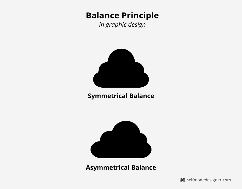
5. Balance
Balance refers to the total symmetry of a composition.
That is:
When we look at a design, we evaluate its total appearance in terms of the harmony of all of its elements.
The question is:
How are the elements of the composition weighted in relation to one another?
Balance manifests itself in at least two ways:
- Symmetrical Balance
- All the elements of the composition are distributed equally.
- Elements of the same category or form having the same rank or importance.
- The focus of the composition is in its center.
- Asymmetrical Balance
- The elements of the composition are not necessarily distributed equally, but their placement on the page results in harmony (they make visual sense).
- The focus of the composition is not necessarily its center.
Apply Logo Theory to Your Designs Right Now
Logo theory and principles are the foundation of a solid logo creation process.
With a general understanding of how a logo works, you will be able to achieve effective results that are repeatable and consistent.
Even more:
Understanding the main principles behind the logo process will guide you in creating logos that are distinctive, memorable, and timeless.
Study these principles and see how they apply to the logos that we see everyday.
MY NEW ONLINE COURSE
Thinking Like a Designer
Learn my proven method to finally understand the rules of any design and jumpstart your path to become an effective graphic designer

About the Author:
Ruben Ramirez teaches digital media in college and started Self-Made Designer to share his knowledge of graphic design. He is also a self-taught designer.