You need to understand graphic design principles in order to succeed as a graphic designer. Becoming a designer is not only about learning to use Photoshop or Illustrator.
Graphic design principles apply to anything you create, from logos to newsletters to websites and videogames.
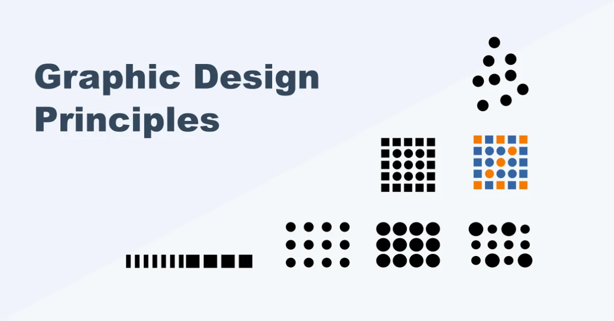
In this complete guide, I explain the 7 most important design principles and describe how to apply them in the real world.
Then I show you real examples of how designers have applied each principle.
Ready? Let’s begin.
Graphic Design Principles Explained
Our objective as graphic designers is to represent objects, feelings, ideas, or concepts in visual terms.
Design principles allow us to make effective graphic representations by giving us a framework for arranging the visual components of our compositions.
Here’s a definition for graphic design principles:
Graphic design principles are a set of guiding “rules” about what works and what doesn’t work in a design or composition.
Design principles serve as a map for arranging visual elements in the best possible way, according to specific intentions, strategies, and objectives.
In other words, design principles are proven guidelines that humans have put together through trial and error in their quest for understanding how to represent the world.
But remember this:
Each design principle works in relation to other design principles. They never exist in isolation. In fact, each principle piggybacks on each other, creating a symbiotic relationship.
The Problem: Design Textbooks List a Ton of Principles
In 2013, Professor Miles Kimball examined a huge amount of graphic design textbooks and found that, together, they list hundreds of different design principles. He then asked designers which principles they taught or used the most.
He then correlated this information and discovered the most common principles taught in graphic design.
Why is this important? Well:
While there are many graphic design principles out there, you only need a handful to achieve a good level of design.
You can focus on the design principles that matter the most as you learn to think and create like a designer.
The more you practice and the more you apply these principles, the better you get as a graphic designer.
The 6 Most Important Graphic Design Principles You’ll Need
After years of reading design books and teaching graphic design, I have found the following design principles to be the most useful:
1. Unity
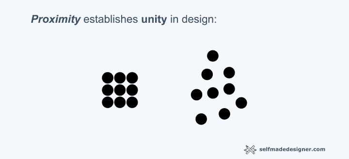
The unity principle has to do with the relationship between the elements of a composition. Through relationships, we are able to communicate status, mood, structure, kinship, hierarchy, etc.
The unity of a design establishes the purpose of its components and the cohesion of the composition.
Unity manifests itself in terms of proximity, similarity, and repetition:
1.1. Proximity
Proximity as a manifestation of unity relates to the distance between the elements in a composition.
This is the rule:
The closer the elements in a composition are, the stronger the relationship is between them.
Let’s look at some examples:
Each of the following images has the same amount of dots.
However, the variations in proximity in each creates different relationships not only between its respective elements but between each set:
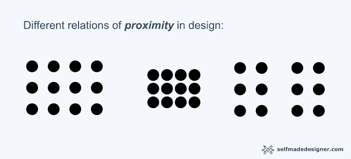
The proximity or closeness in the first set communicates a stronger relationship or kinship between its circles, while the distance between circles in the last set communicates a weaker relationship.
In the last set, the proximity between the six dots to the left and to the right communicate that each subset belongs to a different “camp.”
This is evident in the following example:
Again, the closer the elements are, the more of a relationship they present.
1.2. Similarity
Similarity establishes a relationship among elements of the same appearance.
This is the rule:
The more elements look alike, the stronger the relationship between them.
Similarity can be established through:
- Size
- Color
- Form
- Position
- Texture
In the next examples, how are elements united?
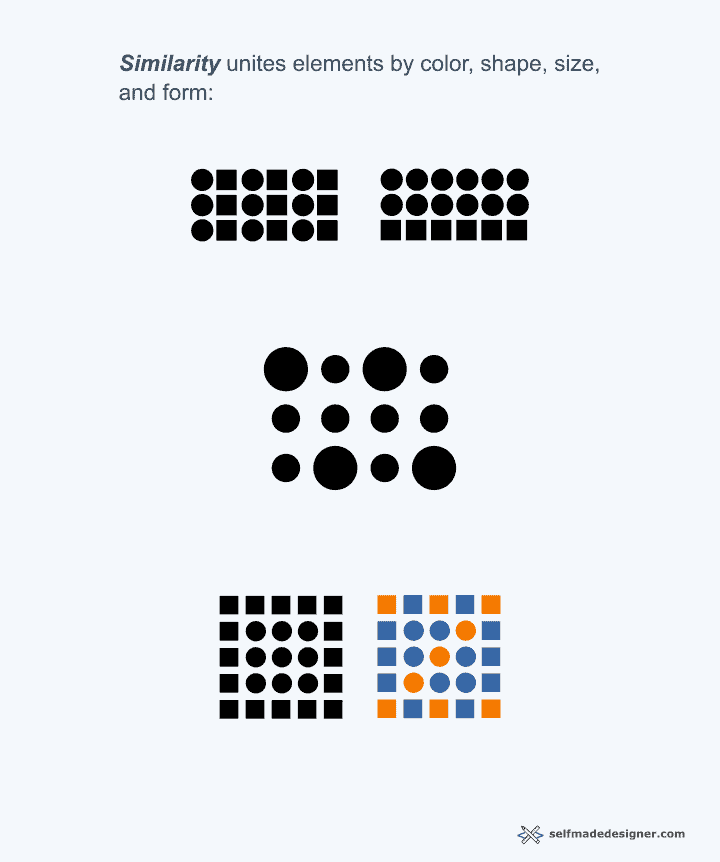
Can you see how similarity achieves unity?
Shape, size, and color establish relationships of kinship between certain elements.
Also, did you notice that similarity is not the only unity principle at work?
Exactly!
Similarity is working hand-in-hand with proximity. This is what I mean when I say design principles never work in isolation.
1.3. Repetition and Rhythm
Repetition can work in the same way as similarity, but may be more dramatic.
This is the rule:
The more elements are repeated, the stronger we associate them with a certain idea or effect.
Also, the more we repeat an element, the more rhythm a composition has.
Look at the following examples:
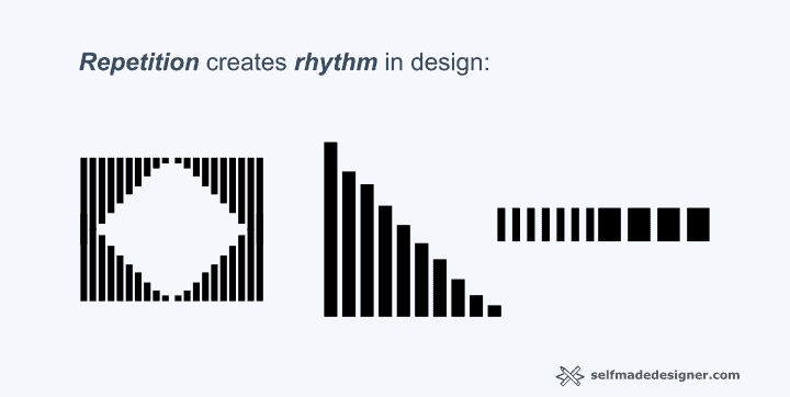
Notice how the repetition of elements and shapes in each example creates an effect of rhythm that results in visual unity.
Also, notice how the variation in repetition (size of elements and position) in the second and third examples results in a more dramatic, less boring composition.
This is called variation.
Unity in Graphic Design: Real-World Examples
The work of Piet Mondrian and Chuck Close present excellent examples of unity as a principle of design:
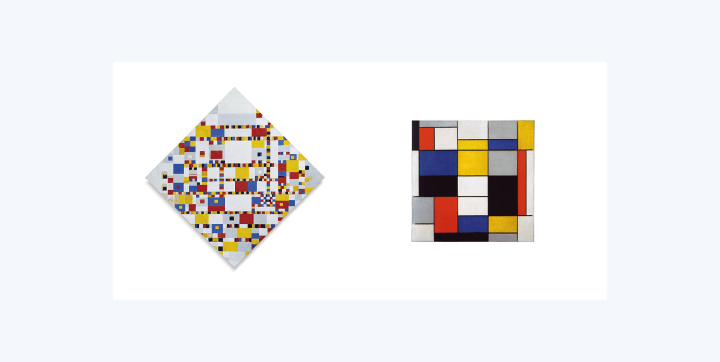
In Mondrian’s painting, notice how shapes, color, and size, and their repetition, creates a unified composition that is rhythmic and interesting.
In Close’s self-portrait, we see a more complex application of unity as design principle:
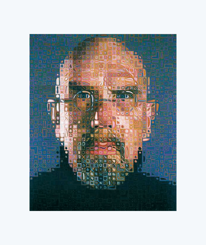
Each tile is a repeated element that is strategically positioned, making use of color and size to form the face we recognize as Chuck Close.
In sum:
The strategic unity of elements creates the portrait in a rhythmic, complex way.
2. Totality (Gestalt)
The German term Gestalt refers to the “totality” or “wholeness” of a design.
Gestalt comes from the field of psychology, and attempts to understand how humans perceive meaning in the world.
I will use the term “totality” to refer to this human capacity to perceive things as a whole.
When you encounter a chair, do you perceive its parts separately (the legs, the cushion, the wood) or do you perceive the totality of the chair?
We perceive the whole thing all at once, right?
So, “totality” (in the sense of Gestalt) is our ability to create some kind of visual “closure” about the things we perceive in the world.
Totality in design is our ability to create structural wholeness in a composition.
There are three important components of totality:
- Figure/Ground
- Closure
- Continuity
2.1. Figure / Ground
Figure/Ground in design relates to the interplay between an object and its surrounding space.
What does this mean?
It means that graphics can only be formed by white space and the actual object in a piece of paper or computer screen.
This is what designers usually call “negative” and “positive” space.
The play between these two elements, space and object, can lead to complex designs that can communicate at various levels.
Have you seen this image before?

What do you see?
If you see some kind of chalice or coupe, you’re right. If you see two faces, you’re right as well!
This is the thing:
The play between space and object, or negative and positive space, create the graphic representation.
Here’s another example of figure/ground:
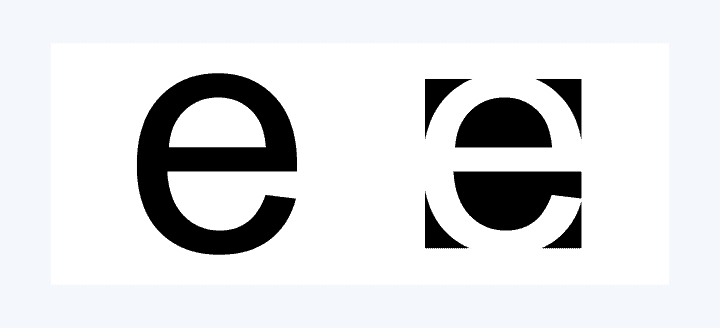
What “writes” the letter “e”? Is it the stroke or is it the space?
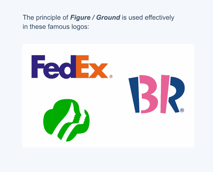
Figure/Ground in Graphic Design: Real-World Examples
Many great logos use the principle of Totality (Gestalt) to create memorability and distinction.
Look at these examples using Figure/Ground:
2.2. Closure
Closure in design relates to our ability to “fill out” the blank spaces.
Have you seen this meme before?
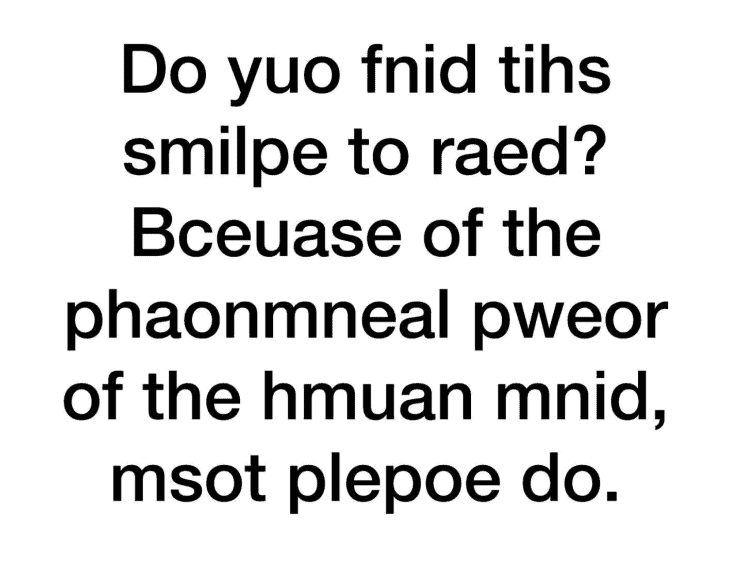
Why were you able to read it?
It’s because of our ability to “complete” what’s missing if we have enough background information.
If we have enough visual information, we are able to imagine what’s missing and process designs in complex ways.
MY NEW BOOK
The Accelerated Graphic Designer
A Proven Shortcut for Learning Graphic Design Once and For All
Stop wasting time learning unnecessary skills from random tutorials and start learning what matters the most in design.
If we make designs using the closure principle, we create compositions that are interesting, complex, and eye-catching.
Look at the next example:
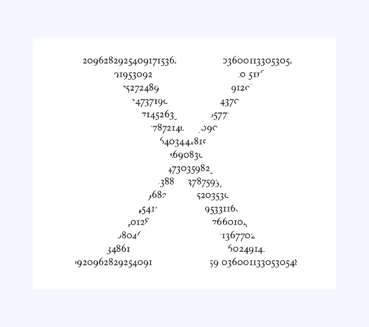
Here, there are no boundary lines defining the letter “X”, and yet your mind “creates” the line for you, which allows you to decipher the content of the design.
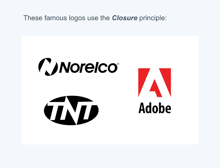
Closure in Graphic Design: Real-World Examples
The following logos use the closure principle nicely.
Notice how your brain “creates” the missing border for each icon even if it’s not there. This creates interest and a level sophistication:
2.3. Continuation (Continuity)
Continuation (also called continuity) in design is the idea that the elements of a design can create the illusion of going beyond the space that contains them (for example, the page, t-shirt, or screen in which it is shown).
By using the continuation principle, design elements seem to go off the page, which makes the design seem larger and highly dynamic.
Look at the following example:
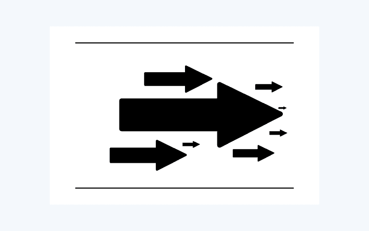
The arrows convey a sense of looking beyond the page, which reflects the continuation of the composition
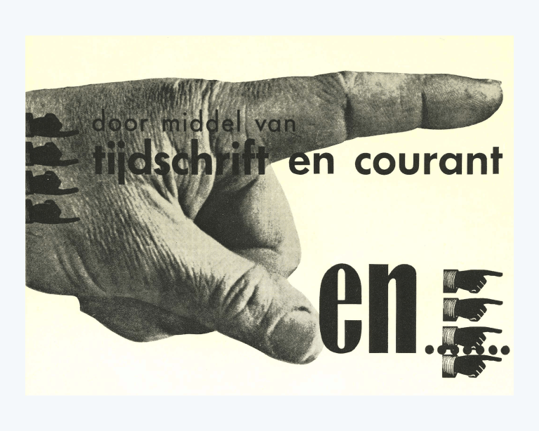
Continuation Principle: Real-World Examples
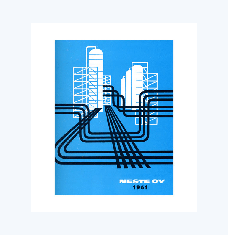
This 1961 design, by Oli Stelander, is an excellent application of continuation.
See how the “pipes” go beyond the composition in order to convey a feeling of flow, length, and extension?
Also:
Can you see repetition and rhythm working their magic?
Here’s another example:
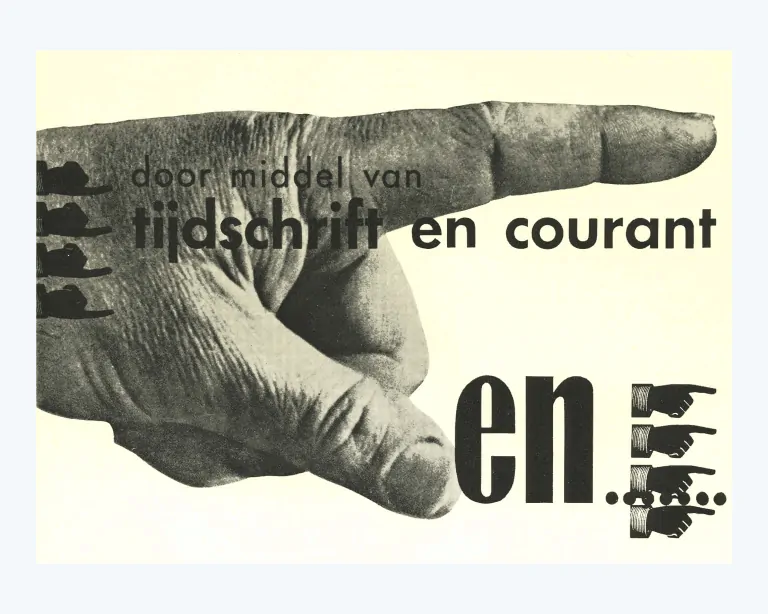
This classic composition, by Piet Zwart, uses the continuity principle to convey a sense of direction that goes well beyond the composition.
3. Space
Common sense tells you that space is empty, right?
Wrong!
Space is one of the most powerful elements of design.
Just like zero is not nothing but something (a number), space is the all-encompassing fabric that holds all the elements that make-up a design.
Space is a design principle because you can manipulate it to create a sense of cleanliness, clarity, focus, and attention in a composition.
Space is a “presence” in design, it is never “absent.”
This is the rule:
We can use space to enhance the quality, sharpness, and focus on the elements of a composition. The strategic use of space implies the use of “white” space as a force and presence in a composition.
Space Principle: Real-World Examples
Look at this clever 1959 ad from Volkswagen:
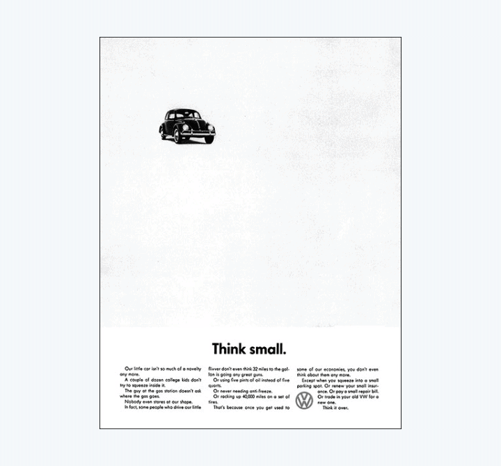
Here, space is used as the main component of the ad.
Even if the ad is selling a car, space is “bigger” than the car, because it accentuates the message being communicated. It creates focus on the car and projects a sense of “cleanliness” and “craftsmanship.”
Here’s another example from a 1974 cover of Print magazine:
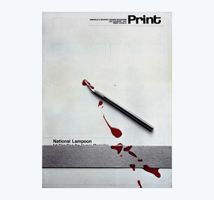
Space here works to highlight the drama of the blood and the “motion” of the blade that just created this mess.
Bonus insight:
The space principle closely relates to the figure/ground principle, because the interplay between positive and negative space is a strategic use of space as principle.
4. Dominance
Dominance in design is the ability of one element to control other elements in a composition. This results in creating a focal point in the composition, which “directs” the “eye” of the viewer.
This is the rule:
Use the dominance principle when you want to convey a sense of urgency, direction, drama, or emphasis.
Dominance Principle: Real-World Examples
Look at these examples:
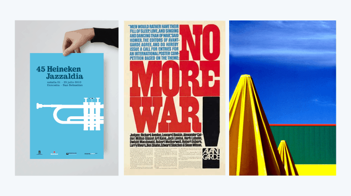
By having one element dominate over the others, we can create interesting compositions that create emphasis or drama.
Without dominance, these designs would be dull and uninteresting.
5. Hierarchy
Hierarchy has a close connection to dominance.
However, while dominance refers to the structuring of design elements (such as icons, shapes, and images), hierarchy refers to the structuring of information.
Look at the following examples. Which one is more readable?
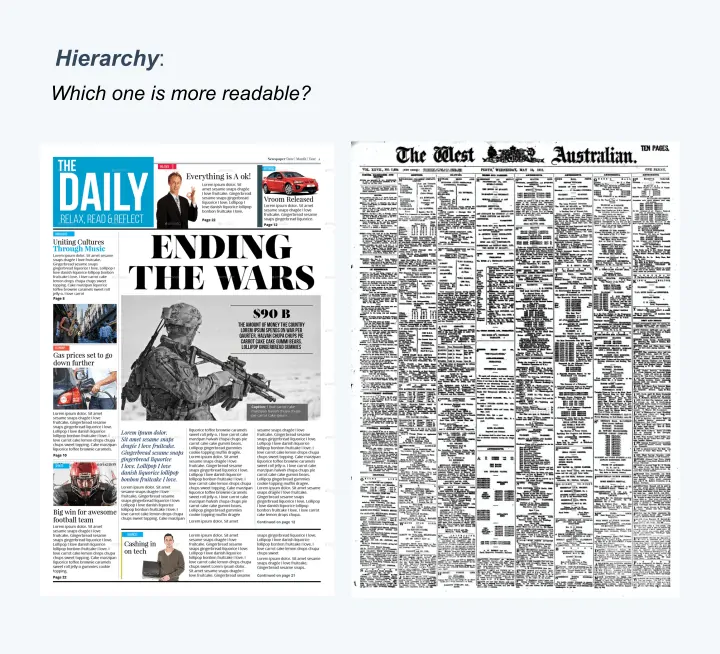
The example to the left has images, color boxes. and headings to structure information and make it more readable.
Here’s the rule:
Use the hierarchy principle to direct the viewer’s attention and establish the logical order in which he or she must “read” the information in a design.
Use the hierarchy principle to give levels of importance to the elements of a composition.
Note that you may use color, size, or form to establish hierarchy.
Also, you establish a hierarchy of elements to direct the viewer’s attention toward the order in which he or she should “read” the design.
6. Balance
Balance is the design principle that binds all other principles up. The goal of a finished composition is to achieve balance.
That is:
Balance in design is a state in which all visual elements are arranged in complete harmony, each one serving its precise purpose in the composition.
Now, balance doesn’t necessarily mean that all elements are perfectly centralized and organized. It means that the relationship among all visual elements has been carefully planned and works.
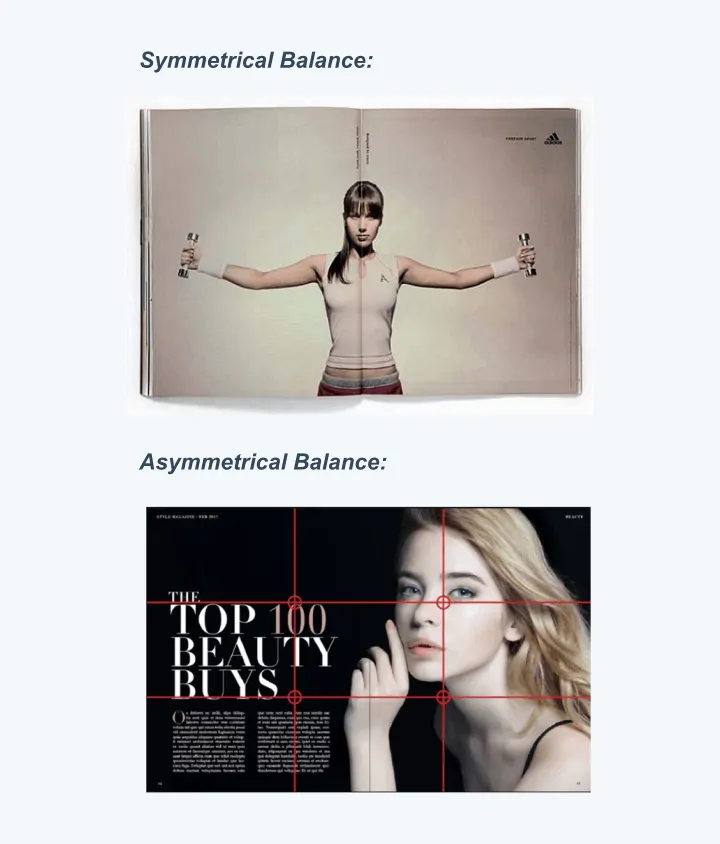
Having said this, balance can be symmetrical or asymmetrical.
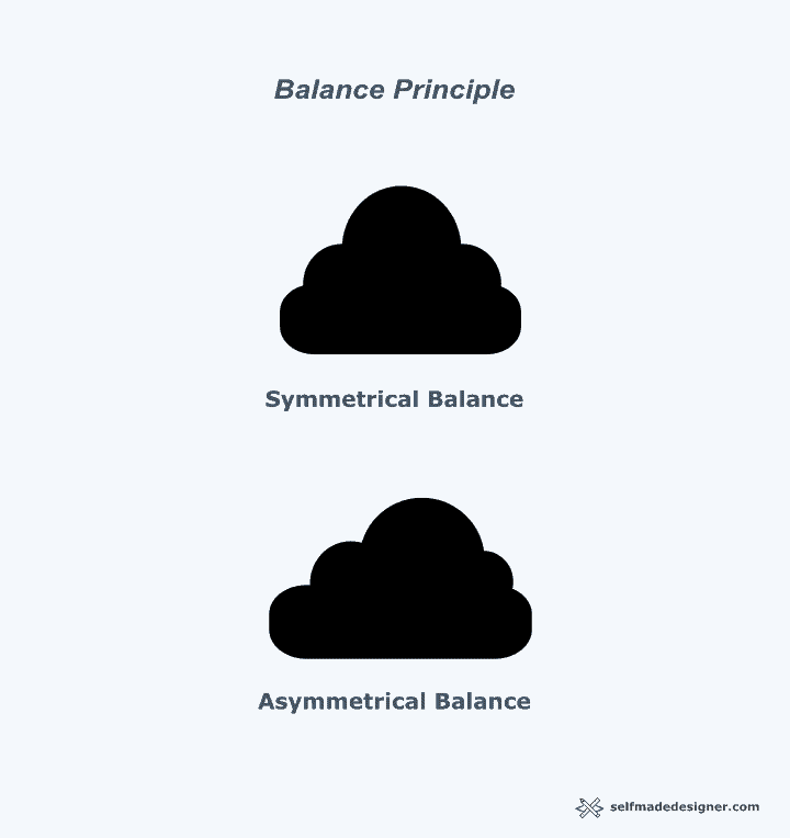
With symmetrical balance, all the elements of the composition are placed equally on the page. They are arranged within an imaginary grid (rows and columns) that distributes them equally in relation to one another.
Symmetrical balance is the easiest to recognize.
With asymmetrical balance, visual elements are not distributed equally.
However, they are distributed in a way that their asymmetry creates what Alex White calls “equalized tension”.
Balance Principle: Real-World Examples
The following examples best describe balance:
Conclusion
Understating and applying the fundamental principles of design is crucial for achieving effective visual communication. If you are an aspiring graphic designer, you must spend time studying these principles.
Without design principles, we will most likely create work that is uninteresting, unappealing and, worse, unable to communicate effectively.
You must learn to see these principles in action all around you. With practice and experience, you will be able to see these principles in action everywhere you look.
These are the main points to remember:
- Design principles are time-proven observations about how the world is visually arranged all around us.
- Graphic design principles do not work in isolation. Each principle complements the other.
- Design principles serve as a blueprint for arranging visual elements in strategic, effective ways.
In sum:
Learn how to apply these graphic design principles and you will be on your way to becoming an effective graphic designer.
MY NEW ONLINE COURSE
Thinking Like a Designer
Learn my proven method to finally understand the rules of any design and jumpstart your path to become an effective graphic designer

About the Author:
Ruben Ramirez teaches digital media in college and started Self-Made Designer to share his knowledge of graphic design. He is also a self-taught designer.