
Graphic designers play a crucial role in the creation of websites. Before a website is programmed or coded, it first must be designed.
In fact:
One of the very first skills I teach my students is to design website layouts.
Why?
Without good design, a website is likely to fail at attracting and communicating to an audience. And today, websites are one of the main ways brands and businesses connect to an audience.
In this guide, I will show you the steps you need to create a successful, well-designed website layout or mockup.
These are the steps for creating a successful website layout:
- Step 1: Research and Plan
- Step 2: Sketch Your Layout
- Step3 : Create a Lo-Fi Wireframe
- Step 4: Create a Hi-Fi Wireframe
- Step 5: Test Your Website Mockup
We will be creating a homepage, but this will work for any type of page.
Now let’s get to the details.
Get Your Free Guide
Design Fundamentals for AI Creators
Learn how to use AI tools like a creative director, not just a prompt writer.
Discover the essential design principles that make your AI-generated visuals look professional, balanced, and brand-ready.

My Entire Website Layout Process (Video)
Before I go into the details of designing your website layout, let me show you how I actually design a website layout using Inkscape.
In this video, I demonstrate the entire process of designing a website layout for a homepage mock-up.
The result is a high-definition image that I can upload to a browser, such as Chrome or Firefox, that looks and feels like a real website.
This part of the process is crucial for fine-tuning important details, such as spaces between sections, paragraphs, and sentences; font-sizes; colors; and the scale of objects, such as images, icons, and buttons.
Once you get everything exactly right, you can make detailed specifications that you can use yourself in the programming phase or pass on to a programmer to get the design pixel-perfect correct.
Plus:
Doing a mock up right liberates a ton of time in the programming stage.
How to Design a Website Layout?
To design a website layout, you need to create a static graphic image, or mockup, of the homepage that will become your website in order to establish its basic structure, color palette, and visual elements before the programming stage.
A website mockup is a graphic representation that looks exactly like a webpage, but that is completely static. It displays graphics and information just like a webpage, but it’s only an image loaded to a browser.
You may ask:
Why is creating a website mockup important?
Creating a website mock-up is important for specifying how a website will look and feel before any programming or web-building effort is made. Because you are planning and strategizing design, it allows you to create a visually stunning page while also streamlining and facilitating the programming phase.
If created correctly, a professional mockup can be loaded to a browser such as Chrome or Firefox and will look exactly like a website, but without any clickable elements.
If you will be creating a website for a client, a mock-up will allow you to propose and sell a website design before any costly programming is made.
A website mock-up is a simple, low-cost, time-efficient way to maximize your design and programming efforts.
Step 1: Research and Planning
Before you begin designing your website mock-up, you need to do some planning and research.
Ask yourself:
- What are well-designed examples of pages relevant to your market, product, or niche?
- What sections do they include on their main page? What type of information do they showcase?
- What visual elements do they use to communicate their purpose and objectives?
By understanding the design choices of your competitors or key players in your space, you will be able to plan a design strategy that looks professional and relevant, and that will make your website stand out.
At the planning and research stage, you should aim to accomplish the following:
- Understand the main objectives and communication goals of your site
- Choose a relevant, functional, and beautiful color palette appropriate to your brand and niche
- Have a basic idea of the different page sections you will need on your main page
- Start itemizing the main graphic elements your will need for the main sections, such as images and icons
- Start developing relevant copy for the main page sections
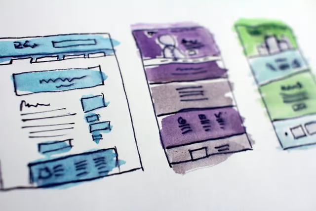
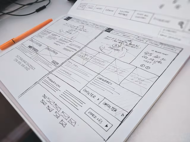
Step 2: Sketch a Wireframe
After this initial research and planning, you are ready to begin the design phase.
However, we are not ready to go all out yet! We will start with a minimal version and start working from there.
Enter the wireframe.
What is a wireframe?
A wireframe is a stripped-down version of your website or app that demonstrates all the basic content and visual elements to be placed on a screen without all the details, such as content, graphics, and visual elements.
A wireframe has many benefits. A wireframe allows you to:
- Demonstrate visually how a page will look like without having to commit to hours of design and programming
- Design from a concrete point of view, not in the abstract
- Quickly move about elements on a page to determine the best layout
- Test-out different layouts, visual elements, and page arrangement on the fly
The best way to begin wireframing is to sketch by hand. You can use a blank page, but grid paper is even better as it allows you to position elements correctly and in the right proportion.
Because website and app screens are rectangular in nature, they are fundamentally determined by cuadrangular shapes.
This means that a website wireframe can be created mostly with rectangles and squares. By using these shapes, you will be able to block all the main components of your page without having to go into any details.
By thoughtfully choosing these initial cuadrangular components, you will be able to start visualizing the look of your website and build from there.
Plus:
Building up from the general to the specific will make the task of design less daunting and intimidating.
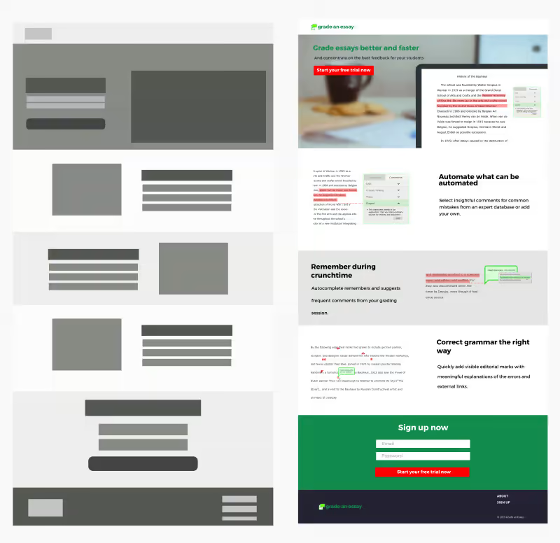
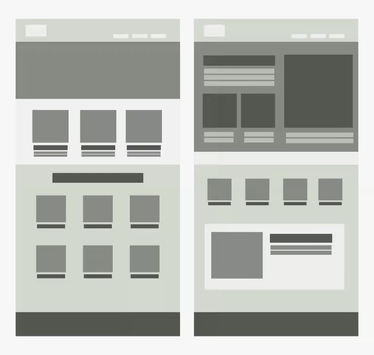
Step 3: Lo-Fi Wireframe
Now that you have sketched a couple of possible scenarios for your website, you can now start designing in a more committed way.
Using graphic design software, you can now start creating what will become your website mock-up.
I prefer using vector graphics software, as it allows me to move elements freely on the page.
First, set-up a document that has the dimensions of a webpage on a browser. I use a 14 inch laptop, so I find that a document of about 1,200px wide will fit the browser window almost like a real webpage when tested.
The length of the document will be determined by the number of sections to be included in the page, but it will typically look like a rectangle in portrait orientation (vertical).
Now, use the boundaries of that document (vertical rectangle) to start positioning the different sections and elements.
You will use square and rectangular shapes to start populating the page.
Notice how the rectangle starts to look like a webpage but without the details. This is the magic of a lo-fi wireframe.
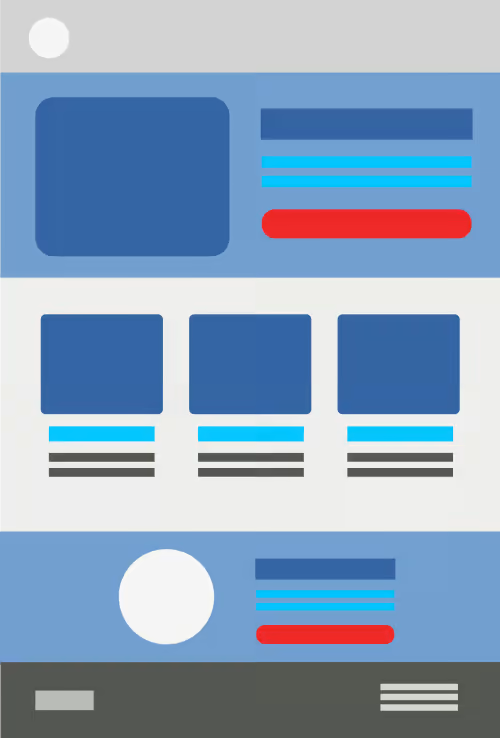
Step 4: Hi-Fi Wireframe
Now that you have sketched your website on paper and created a vector lo-fi wireframe that shows all the main parts and placeholders for visual elements, it’s time to create the final version of your webpage mockup or dummy.
At this point, you will basically start replacing the cuadrangular shapes in your lo-fi mockup with actual images, graphic elements, and text.
Here, you should go all out in terms of graphics: The images, icons, and other graphic elements should be in the correct size and proportion, already manipulated and ready to be published.
You should have a defined color palette and all visual cues signaling dynamic content should be specified and in place.
For example:
- If you hover on a clickable element, such as a hyperlink or a button, does the element change color or size?
- If there is an image gallery, is there an arrow icon that signals the user to click for more?
- If you want someone to follow you on social media, are there social media icons that blend in with your branding and color palette?
As you can see, there are many visual decisions that must be made on only one webpage.
However:
You only have to make these decisions once, as they are applied to all other pages of a website.
Step 5: Test Your Mockup
Once you have created the complete mockup of your page, you are now ready to test that page on a browser.
Actually, you should be constantly testing your mockup as you progress in your design, since it is in the actual environment of a browser that you can really determine whether your text and visual elements are in the correct size, position, and proportion.
To test your page, export an image version of your document. Next, drag-and-drop to a browser, such as Chrome or Firefox.
Depending on the size of your browser and the size of your website mockup in pixels, your image will cover the browser and look as if a web page has been loaded.
Adjust the Zoom percentage on the Page View settings if needed. You can also go back to the graphics software and increase or decrease the width of your mock-up to fit your computer screen accordingly.
You have now created a website mockup that can accurately show a client or programmer how exactly your website should look like.
Website Layouts Explained
Before you design your website in detail, you need to understand the structure of its different components.
The place of images, text, and icons must be positioned on the page before the actual design phase. This is ideally accomplished on the wireframing stage.
The layout of your page will depend on the amount of content you need to display.
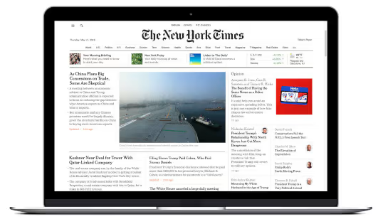
The layout of a news website, such as the New York Times, is very complicated since you need to fit a lot of elements and text on a single page.
Other pages, such as a blog homepage, can be less complicated and cluttered.
Parts of a Website
In order to design a website mockup or wireframe, you need to understand the different components of a website.
Typically, a web page will include the following elements:
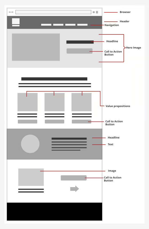
Header
The header is the top-most element of a website. It displays branding information, such as the website logo. It can also include the main navigation of a website.
Main Navigation
These are the main links to other pages on your website. Here, you can find links to an “About” page, the blog section of your site, or to a “Resources” page.
Hero Section
Right after the header, modern websites display what is called a “Hero” section. This section displays a striking, large-format image or graphic that sets the tone and message of the website in the best possible way.
It also includes a large headline that summarizes the objectives and value of the website, followed by a button or Call-to-Action.
Value Proposition Cards
Sometimes, right after the Hero Section, we want to further communicate the value of the brand or service offered by a website. So, we use three or more “cards” that explain in more detail what the brand or service can do to solve its audience’s problems.
This is the purpose of this section: To further persuade a user to keep on reading or take some kind of action on the website.
Sidebar
Sidebars are elements placed typically on the right side of a web page.
These elements are mostly displayed as cards and are used to display additional information that is not part of the main content.
Usually, we use sidebars to display advertisements, or calls-to-actions, such as a newsletter sign-up form.
Call to Action
A call to action is a prompt you give your audience to perform some desired action.
You can have a call to action for someone to sign-up to a newsletter, download an ebook, purchase a digital product, or click on a specific link.
Calls to action are typically displayed as a button that literally prompts someone to perform a desired outcome.
Footer
The footer is the bottom-most part of a website. Here, you can display links to other pages in your website and, most importantly, fine-print information, such as links to privacy policies, disclaimers, and copyright information.
Do You Need to Create Actual Content for a Website Mockup?
You don’t need to create content, or actual words, for a website mockup. You do need actual dummy text that will demonstrate how words and sentences will flow on the page, as well as to show the typography to be used and their combinations.
Fortunately, you can rely on Lorem Ipsum, latin placeholder text that has been traditionally used as dummy text in the publishing and graphic design industries for decades.
There are many Lorem Ipsum generators out there from which you can extract dummy text according to your specifications.
Also, graphic design software, such as Inkscape, have dummy text extensions that will allow you to generate text on demand as you design your website layout, dummy, or mockup.
Conclusion
Website design is much more than programming. As you have learned, a professional website starts with a sound design strategy that builds from the general to the specific. This saves time and resources and allows you to streamline the design and programming process.
In order to design a website mockup, you first need to plan your design by researching other websites in your niche or space.
Next, yor begin the design process by making hand-made sketches of different layout possibilities.
Then, you can begin to design using graphics editing software, such as Illustrator or Inkscape. But at this stage, you are only creating a lo-fi mockup of your layout with boxes and geometric shapes.
Next, you can begin a hi-fi version of your mock-up, which includes the color palette you will be using, images, and graphic elements. You can also include dummy text to display the main content parts.
Once you have designed every detail, you can drag-and-drop your website mockup image to Chrome or Firefox to test how your page will look like on a browser. You can test how elements will display, such as how big or small your text is.
Now you can go to the programming phase.
Leave a comment below and let me know your struggles with website design.
Free eBook
Design Fundamentals for AI Creators


About the Author:
Ruben Ramirez teaches digital media in college and started Self-Made Designer to share his knowledge of graphic design. He is also a self-taught designer.