Great logos follow proven principles of logo design.
So:
If you want to create logos that are powerful and effective, you need to understand how logos work, how they communicate, and what makes them appealing.
Enter logo design principles!
In this post, I explain the 7 most important principles of logo design with lots of helpful examples.
Let’s get to it.
MY NEW ONLINE COURSE
Thinking Like a Designer
Learn my proven method to finally understand the rules of any design and jumpstart your path to become an effective graphic designer

What are the Principles of Logo Design?

Logos are one of the oldest forms of graphic communication.
And today, logos are one of the most important aspects of a brand.
In fact:
Logos have become the only way brands can distinguish themselves from all the noise and competition out there.
As a designer, you need to create logos that are able to convey a brand’s identity, purpose, and nature effectively.
Before you fire up Illustrator and start drawing, you need to understand the theory at the foundations of logo design, such as Gestalt theory, the different types of logos, and, most importantly, the principles of logo design.
You ask:
What are the principles of logo design?
The most important principles of logo design are:
Let’s look at these principles in more detail.
7 Fundamental Principles of Logo Design
Great logo design also follows its own guiding principles that are specific to the demands of communicating through logos.
I have found the next 7 logo design principles to be the most useful and universal.
In this case, I’m using David Airey’s awesome approach to logo design principles, detailed in his excellent book Love Logo Design.
1. Simplicity
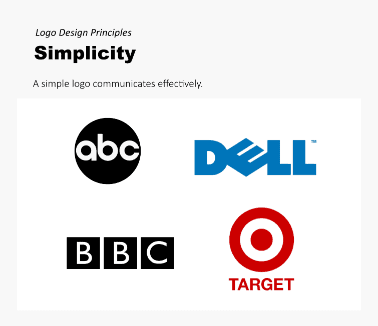
If you can learn only one principle of logo design, it should be this: Simplicity.
I would even say this:
The principle of simplicity is present in all the other logo design principles.
Why?
Because a logo must be simple in order to communicate effectively, and communication is the main objective of a logo.
Simplicity allows a logo to be flexible, focused, and memorable.
The more you try to fill up a logo with visual elements, the more cluttered and scattered it becomes, and thus the less effective it is at communicating that single, most important message.
The only way you can achieve this is by keeping your logo straightforward and uncomplicated.
However, this in no way means that a logo should not be well-thought or have depth.
It means that the fewer elements you can use to communicate the idea, concept, or “feel” behind a brand, the more effective a logo is.
As the classic Bauhaus School saying says, “Less is more”.
Use only what you need and the elements that convey the intended meaning in the most powerful way.
2. Relevance
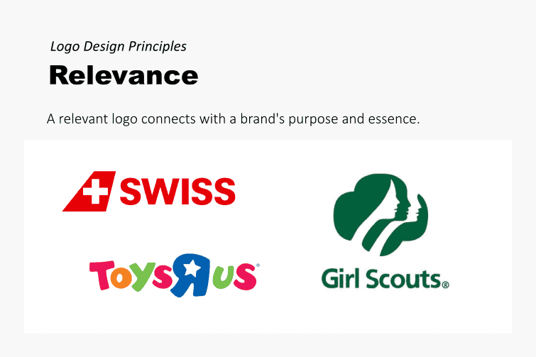
A logo is relevant if it connects with the objectives, mission, principles, and nature of the brand it represents.
You achieve relevance by looking at your brand in depth, which can be done by researching your brand extensively.
This means asking questions about the brand or organization a logo represents.
For example:
What are the brand’s customers or stakeholders?
What values does it cherish or promote?
What’s its competition like?
What does it wish to accomplish?
A relevant logo is able to represent and reflect a brand’s most important values or ideals in the most direct way.
A logo is an intimate reflection of a brand’s essence.
3. Longevity
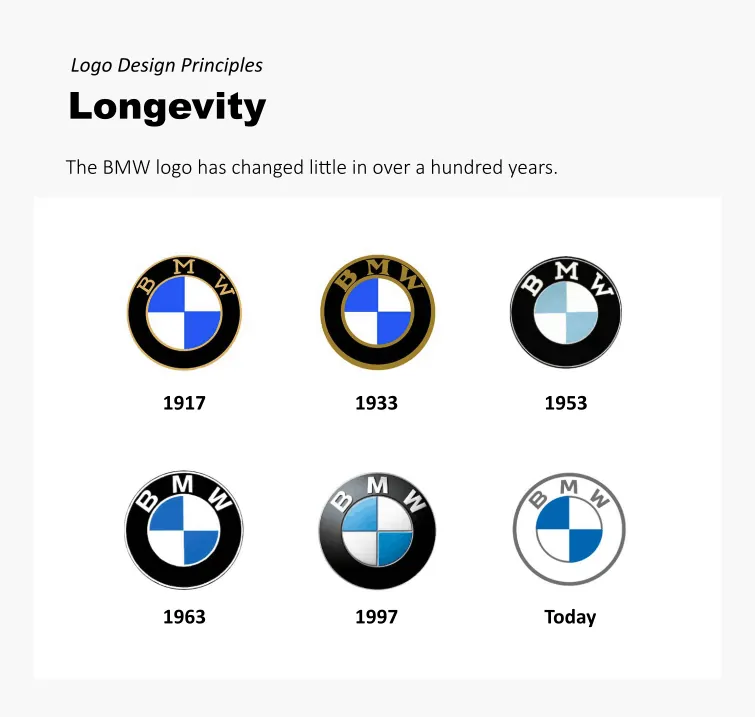
As a general rule, a logo must be able to withstand the passing of time.
A logo’s design and features must be able to remain relevant while maintaining a “timeless” quality.
Simplicity is a great ally of longevity. The reason is that the simpler a logo is, the best it can accommodate to the passing of time.
In other words, the more complicated the structure of a logo (color, gradients, complicated features), the less likely that logo can adapt to changing trends or esthetic values over time.
4. Distinction
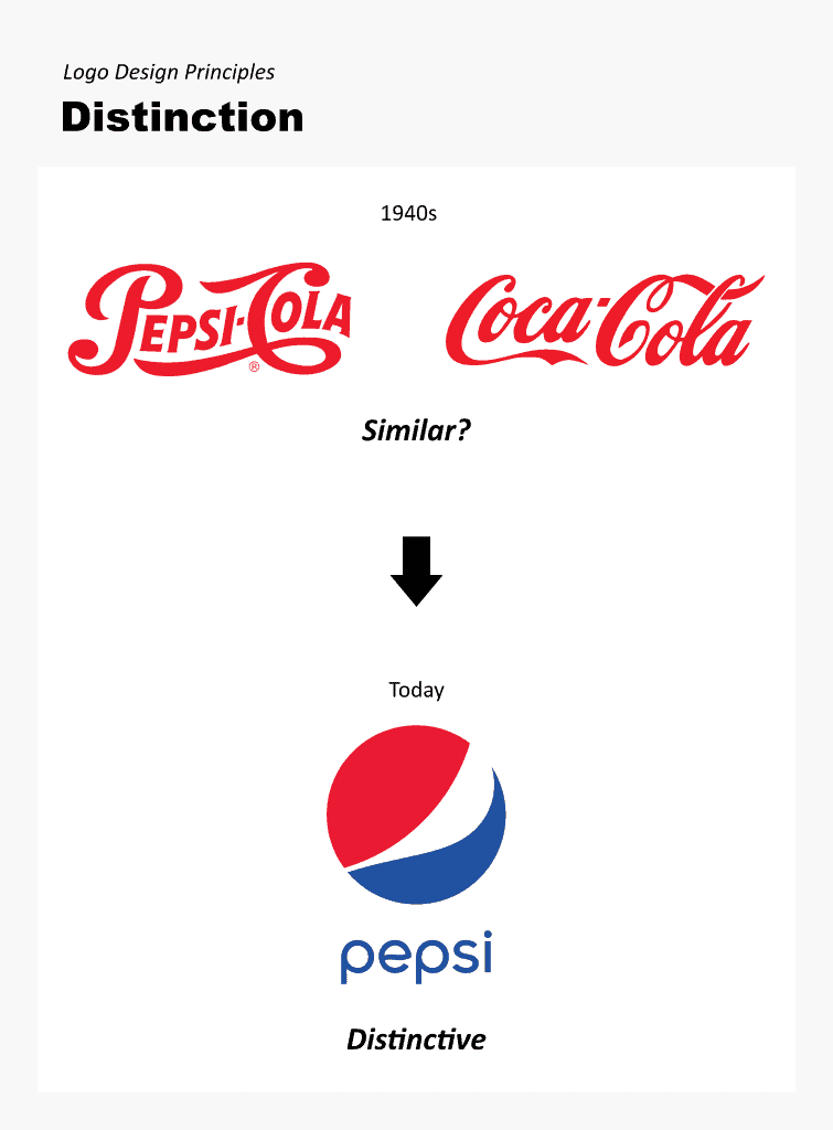
Today, everything is branded, and we increasingly rely on images to make decisions.
So:
A logo must be able to effectively distinguish itself from the competition.
This is what I mean:
Have you ever been to a deodorant aisle at your local drug store or supermarket?
Most of the labels look the same!
If you were designing a label for a new deodorant, how would you make it distinct?
Distinction can be achieved in different ways, depending on different factors, such as the brand itself, competition, or the market.
You can add distinction to a logo through the strategic use of color or by using a specific style or design trend.
For instance, in a space in which blue is a very common color (such as web apps, for example), you can use purple or orange to achieve distinction.
In a space in which crowded or complex designs is the norm (such as deodorants), a minimalist design might make your brand distinct.
Distinction is all about differentiation in relation to other brands, trends, customer expectations, and strategy.
5. Memorability
What’s the use of a logo if it doesn’t stick in your head?
A logo that is memorable is effective at promoting and identifying a brand.
Memorability especially goes hand in hand with some of the other principles, such as simplicity, relevance, and distinction.
I’ll give you an example:
If you’re driving at 50 miles per hour on a highway, you only have a few seconds to glance at a billboard as your drive by.
Would you be able to remember the brand you just saw?
A memorable logo helps a brand or message get into the viewer’s memory.
Do you want to know the best strategy to achieve memorability?
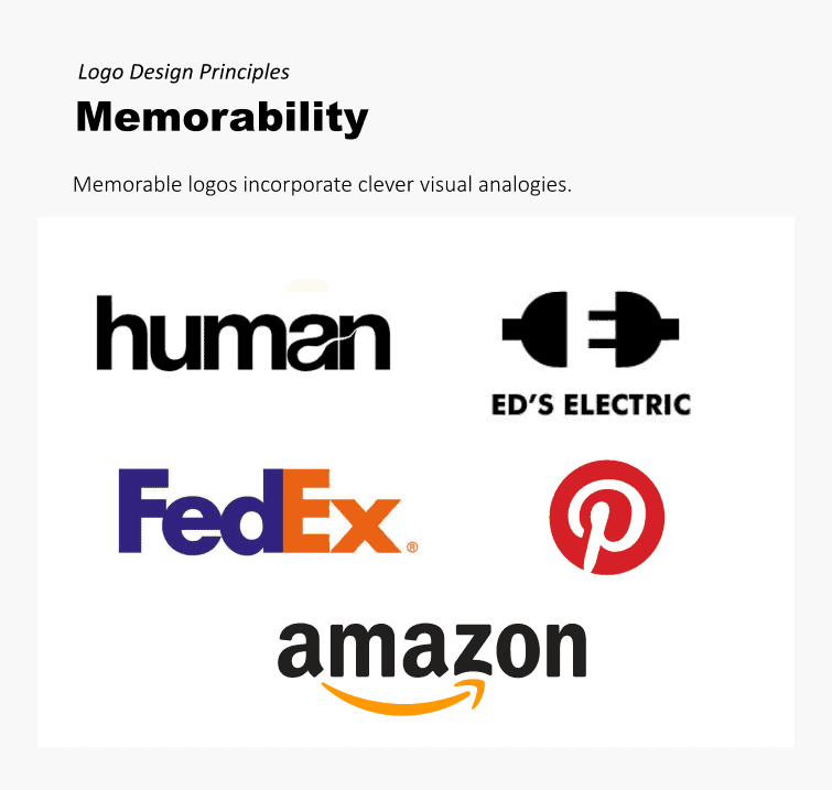
Incorporate a visual analogy.
A visual analogy establishes a 1 to 1 relationship between an image and something that exists in the real world. A visual analogy is really good at summarizing, using only images, the essence of a concept or idea.
A logo that incorporates a good visual analogy helps it become more memorable.
The Amazon or FedEx logos are good examples of memorability.
The hidden smile in the Amazon logo simbolzes friendliness but also the idea of “From A to Z”.
The negative space arrow in FedEx serves as an analogy of the “movement” of goods.
Both logos use a powerful visual analogy to become memorable. Once you discover these hidden icons, you’ll never forget them!
The power of an analogy is the best way to achieve memorability.
6. Scalability
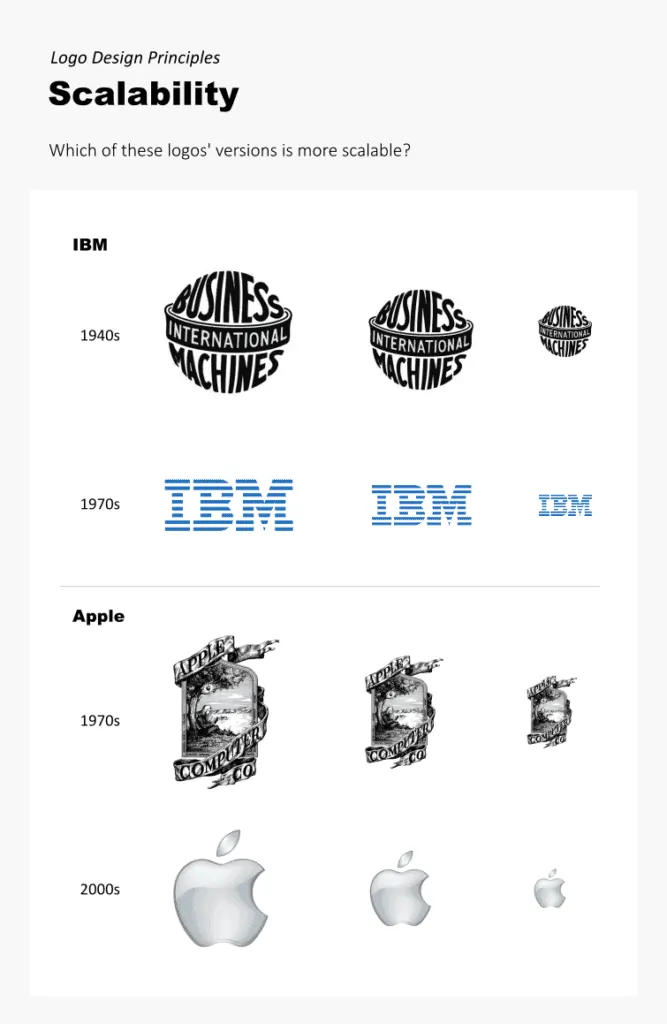
The principle of scalability refers to a logo’s capability of adapting to different sizes and contexts.
This is the most important aspect of scalability:
A logo should function well in both small and large formats.
What does this mean:
A logo should look awesome and convey its meaning in both a tiny embroidering on a t-shirt or business card and on a massive billboard or the side of a trailer truck.
In other words:
A logo must be adaptable. This is what scalability as a principle is all about.
7. Focus
A good logo is focused. It doesn’t cram up multiple, competing attributes in order to communicate complexity.
According to Airey, a focused logo is one that concentrates on only one attribute to make it stand out. One or two attributes (tops), I would add.
Let me explain using Airey’s example:
When Roy Smith set out to update the French Property Exhibition logo, the composition focused on only one attribute: The open door symbolizing the “property” aspect.
Now, in my view, the French “flag” counts as an attribute, so you really have two things going on: The Flag and the door.
But it’s all integrated in a nice, single package.
So:
What counts as visual elements, you ask?
An icon, color, lines, a complicated font, and effects (such as gradients) all count as visual elements that can potentially “ clutter up” and negatively affect the focus of a logo.
In sum:
You don’t want the viewer having the burden of considering too many elements or attributes when they glance at a logo. You want them to see that thing or two that make the logo stand out and become memorable.
Conclusion
To sum up:
An effective logo entails so much more than just a drawing or concept. You must follow sound principles of logo design if you want your logos to be memorable and distinctive.
The following 7 logo design principles will give you a solid foundation for designing excellent logos that deliver:
- Simplicity
- Relevance
- Longevity
- Distinction
- Memorability
- Scalability
- Focus
Once you really understand how these principles apply to effective logo design, you’ll be able to incorporate them in your own design process in order to create compositions that are strategic, compelling, and effective.
MY NEW ONLINE COURSE
Thinking Like a Designer
Learn my proven method to finally understand the rules of any design and jumpstart your path to become an effective graphic designer

